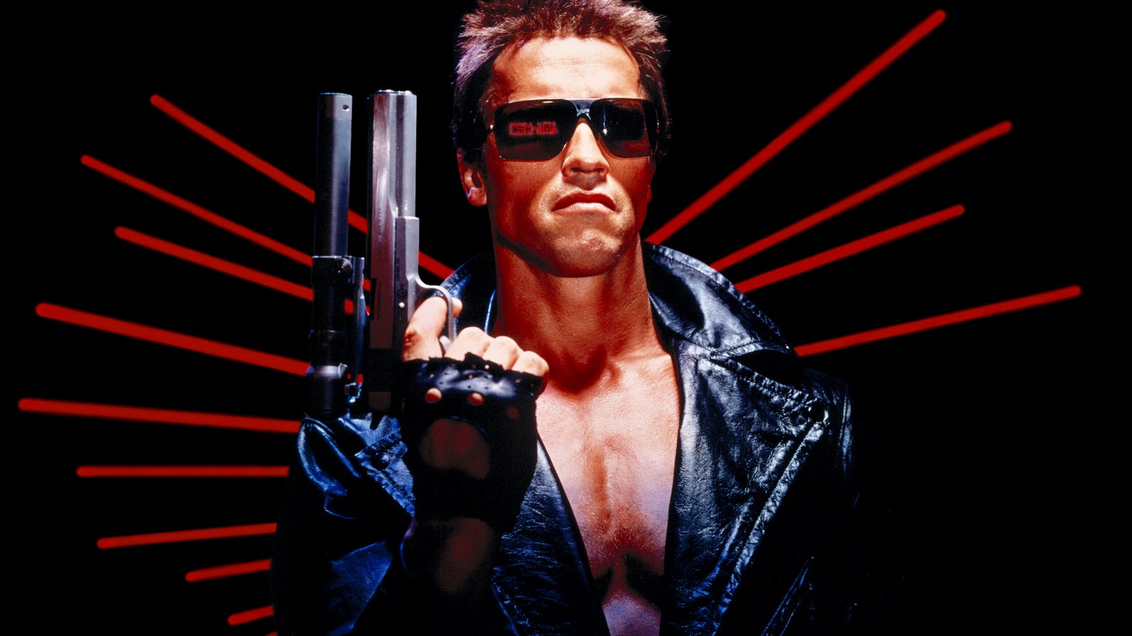
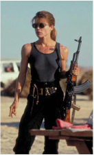
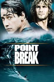
Over the past 20 years or so there has been a trend going around Hollywood movies to constrain the colour palette to orange and blue or amber and teal.
In 2003 a blogger called Edmund Helmer conducted a survey where he watched film trailers and noted down the popular colour trends/palletes used with in. These are his results:
In 2003 a blogger called Edmund Helmer conducted a survey where he watched film trailers and noted down the popular colour trends/palletes used with in. These are his results:
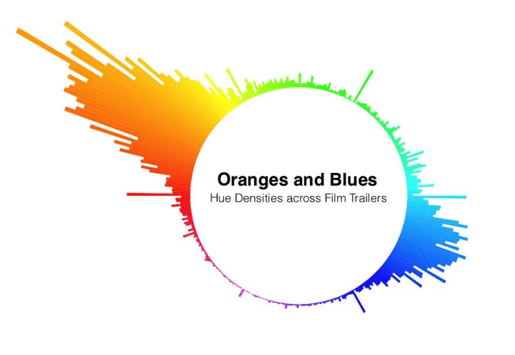
This chart makes it visually clear that the oranges and blues truly dominate movie trailers. Although this colour matching isn't always nice to look at when I was at school I was taught that opposite also means complementary. In this case when orange and blue are side by side they produce greater contrast than either would next to any other colour. And in colour terms contrast is usually a desirable thing.
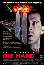
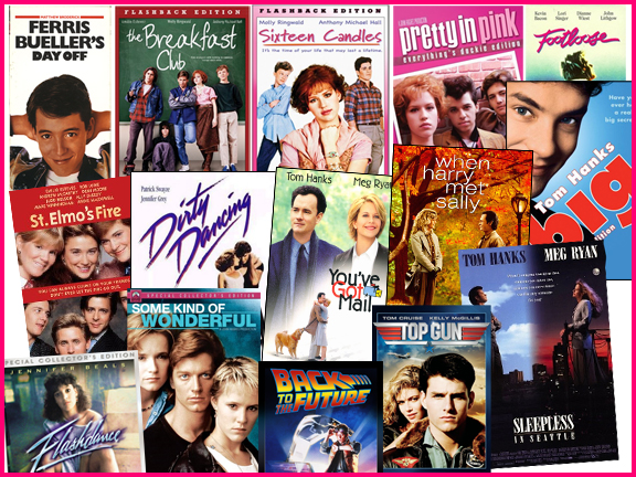
FILM EXAMPLES:


Helmer, E (15.1.2013). Oranges and Blues - http://boxofficequant.com/oranges-and-blues. 3.1.2017
Cime, R (28.1.2015). Why Every Movie Looks Sort of Orange and Blue - https://priceonomics.com/why-every-movie-looks-sort-of-orange-and-blue/. 3.1.2017
Cime, R (28.1.2015). Why Every Movie Looks Sort of Orange and Blue - https://priceonomics.com/why-every-movie-looks-sort-of-orange-and-blue/. 3.1.2017


 RSS Feed
